 My daughter brought The Hunger Games home from school this month. I told her she could read it since she was “almost thirteen” and I couldn’t locate my own copy for her to borrow. We’ve talked about the kid-on-kid violence in the book and the love triangle cliché. But there are themes and issues I think she’ll gain insight from: heroism in the face of oppression, the non-violent resistance expressed by characters like Cinna and Peeta, Haymitch’s PTSD. Besides, it’s a great read, written well.
No, the book’s not the problem.
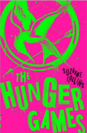
The problem is the cover of the edition she brought home. This picture does not do it justice.
It’s pink and sparkly!?!
The Hunger Games is not a pink and sparkly tale. It does not warrant a fairy-tale princess cover with Dr. Seuss lettering. What are these publisher’s thinking? It’s a “girl’s” book so it needs a “girl’s” cover? Every twelve-year old girl in America has read this book so now we need to open up the market to six-year-olds? Call me crazy, but a pink cover with sparkly green lettering and the title The Hunger Games makes me think the book is a spin on Cupcake Wars.
I suppose they could use this technique on all sorts of “dark” books to trick readers into thinking they’re in for a lighter read. Word War Z with zebra stripes? The Kite Runner with a smiley face on the kite? The Shining featuring Frosty the Snowman? Too bad Amazon previews don’t take a sample from the middle of the books…
You’re off to the Hunger Games…”Today is your day…” to kill off some kids…”So…get on your way!”
Quote extremely modified without permission from Oh, the Place You’ll Go by Dr. Seuss.
